A beautiful website can still lose the sale. Slow pages, vague calls to action, weak forms, and poor mobile layouts quietly drain demand before a prospect ever speaks with your team.
We use this five-step process to find those leaks, fix the highest-impact ones first, and build a better conversion path for premium brands, hotels, property firms, and service businesses.
Table of Contents
- Step 1: Measure Your Current Website Conversion Rate
- Step 2: Improve Site Speed, Visuals, and Mobile Performance
- Step 3: Make Navigation, Search, and Calls to Action Obvious
- Step 4: Optimize Landing Pages and High-Intent Service Pages
- Step 5: Reduce Friction in Forms, Enquiries, and Checkout Flows
- FAQ
- Conclusion
Step 1: Measure Your Current Website Conversion Rate
Before you ask how to increase website conversion rate, define what a conversion means for your business. A hotel may count a completed booking. A villa agency may count a qualified enquiry. A yacht charter site may count a consultation request.
Write down one primary conversion and two supporting actions. For example, your primary goal could be a completed enquiry form. Supporting actions might include a brochure download and a click on the booking button.
Then calculate the rate with one clear formula:
Conversion rate = completed conversions ÷ relevant sessions × 100
Do not mix all traffic into one score. A visitor reading a blog post has a different intent from someone who reaches a property page and clicks “Request availability.” Segment by:
- Traffic source, such as organic search, paid ads, direct traffic, or social.
- Device type, with mobile and desktop kept apart.
- Landing page or page group.
- New visitors versus returning visitors.
- High-intent actions, such as reaching a booking engine or enquiry page.
Attribution also changes the story. Last-click reporting gives full credit to the final touchpoint. That can make retargeting look stronger than brand content or organic search. For a multi-touch luxury purchase, review assisted conversions too.
Hospitality data shows why context matters. Hotel website conversion research from PhocusWire explains that property type, traffic quality, page purpose, and the conversion definition all affect the rate. There is no useful universal target.
Build a simple baseline report. Record sessions, primary conversions, conversion rate, device split, top landing pages, and the largest drop-off point. Keep the date range fixed so later tests have a fair comparison.
For a Mallorca hotel, this might reveal that mobile users reach the booking engine often but abandon before selecting dates. For a property agency, it might show that listing views are strong while enquiry starts are weak. Those are different problems, so they need different fixes.
Use that baseline to pick your first test. Don’t redesign the whole site because one number looks low.

Step 2: Improve Site Speed, Visuals, and Mobile Performance
Speed is part of how to increase website conversion rate, but it is a baseline rather than the whole strategy. A slow page can block every later improvement because visitors may leave before they see the offer.
Start with the pages that attract the most qualified traffic. Test the home page, key service pages, listing pages, and the first step of the enquiry or booking flow. Check them on a real mobile connection, not only on a fast office network.
Look for three common issues:
- Large hero images that load before useful content.
- Video or animation that delays the first interaction.
- Scripts that add little value but slow the page.
Luxury websites need strong visuals. That does not mean every image should be huge. Export images at the size the layout needs, choose modern formats where your stack supports them, and load below-the-fold media only when the visitor gets near it.
Animation needs the same discipline. Animation can make a scroll sequence feel refined, while interactive 3D effects can add another visual layer. Both need a clear job. If an effect delays a booking button, it is costing more than it adds.
Mobile deserves its own review. On a small screen, place the main action where a thumb can reach it. A sticky “Book a Consultation” button can help service sites because the action stays visible as the visitor reads.
Do not hide key details behind a menu. A visitor should find the service, location, price guidance, availability, or next step without hunting. Make tap targets large enough to use comfortably. Keep forms short enough to complete on a phone.
Mobile traffic may convert at a lower rate than desktop for many hospitality sites, yet it can represent a large share of visits. A small improvement across mobile sessions can matter more than a larger gain on a smaller desktop segment.
Our boutique hotel web design guidance for Mallorca follows this order: protect the visual mood, then remove the delay between interest and action.
Run a speed test before and after each major change. Keep a record of image weight, key page timings, and mobile interaction. Faster is useful only when the page still feels premium and clear.
Step 3: Make Navigation, Search, and Calls to Action Obvious
Clear navigation helps increase website conversion rate because it lowers the effort needed to reach a high-intent page. A visitor should not need to decode your menu or guess which phrase starts a conversation.
Start with the top tasks. For a villa agency, that may be viewing properties, checking locations, and asking about availability. For a yacht company, it may be browsing vessels, checking routes, and requesting a charter plan.
Put those tasks in the main navigation. Keep labels plain. “Villas,” “Yachts,” “Suites,” and “Contact” are easier to scan than clever labels that need explanation.
Use one main CTA per page. Secondary actions can remain, but they should not compete with the main path. “Request availability” works when the page is about a stay. “Book a consultation” fits a service page. “View properties” fits a discovery page.
Match the CTA to the visitor’s intent. A first-time visitor may not be ready to submit a long form. Give that person a lower-commitment step, such as saving a listing, viewing a guide, or starting a chat. A returning visitor may need a direct route to an adviser.
Search works like an express lane for people who already know what they want. Add it when the site has a large collection of rooms, properties, yachts, menus, or services. Make the search field easy to find, then show useful results with clear filters.
Check the zero-results state. It should suggest a broader search or a nearby option. A blank page is a dead end.
Use breadcrumbs on deep pages when they help visitors understand where they are. Keep contact details, trust signals, and the main CTA close to the decision point. Don’t force a visitor to return to the home page.
Review your site with five people who did not build it. Give each person a task and watch where they pause. Don’t explain the interface while they work. Their confusion is evidence about the page, not a failure on their part.
We use this review to shape what we call conversion architecture: the way page structure, message, and action work as one path. A cinematic layout can stay bold, but the next move must remain obvious.
Step 4: Optimize Landing Pages and High-Intent Service Pages
Landing pages increase website conversion rate when they keep the promise made before the click. If an ad says “private villa stays in Mallorca,” the page should repeat that idea at once and show the next step.
Build each high-intent page around one audience and one decision. Avoid sending paid traffic to a general home page when a focused service page would answer the visitor’s question faster.
Use this page order:
- A clear headline that names the service and location.
- A short proof point that explains why the offer fits the visitor.
- Strong imagery that shows the experience without hiding the message.
- Key details about scope, timing, location, or availability.
- Trust content, such as reviews, awards, policies, or partner marks when valid.
- One clear CTA with a low-friction next step.
The first screen should answer three questions: What is this? Is it for me? What can I do next? If the visitor must scroll to find all three answers, tighten the layout.
Luxury buyers often need more reassurance before they enquire. Explain what happens after the form is sent. State when a member of the team will respond. If an AI agent qualifies leads, explain its role in simple terms and offer a human route when needed.
That level of system is not the first fix for a broken landing page. First make the offer clear. Then connect lead data to sales follow-up. A score has value only when the team acts on it.
Umania Labs combines cinematic design with technical SEO, multilingual CMS architecture, and built-in AI lead qualification. That gives an international luxury brand one connected path instead of a striking front end with a disconnected sales process. See the Umania Labs studio site for the service context.
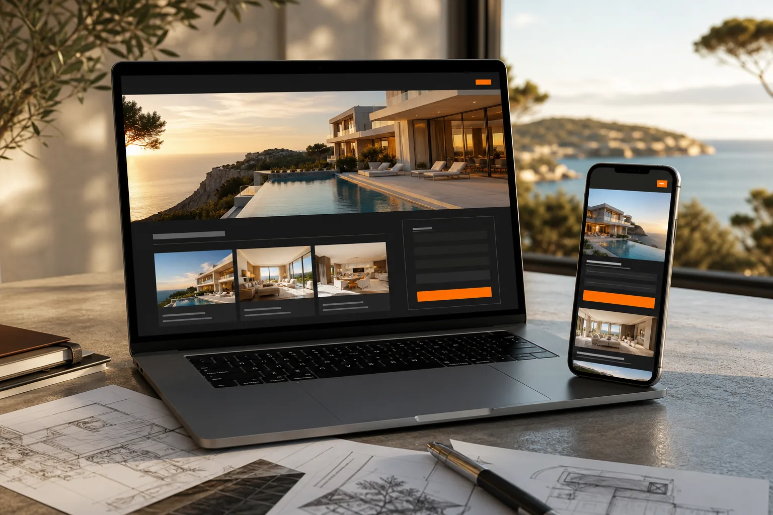
Run one test at a time when possible. You might compare a direct CTA with a softer consultation prompt, or a short hero copy block with a longer one. Set the success metric before launch. Do not judge a page by clicks alone if the business goal is qualified enquiries.
Step 5: Reduce Friction in Forms, Enquiries, and Checkout Flows
Forms and checkout pages decide whether interest becomes revenue. To increase website conversion rate here, remove work that the visitor does not need to do.
Start by listing every field. Keep only what the team needs at this stage. A first enquiry may need a name, email, preferred dates, service type, and one short message. Questions about budget or detailed preferences can come later if they help qualify the lead.
Use clear labels above fields. Do not rely on placeholder text as the only instruction. On mobile, set the right keyboard type for email, phone, date, or number fields. Let visitors correct mistakes without losing what they already entered.
Error messages should say what went wrong and how to fix it. “Enter a valid email address” is useful. “Invalid input” is not. Show the message beside the field and keep it visible after the visitor submits again.
Tell visitors what happens next. A short line under the form can say that the team will review the request and reply by email. Never promise a response time unless the business can meet it.
For e-commerce or direct booking, keep one obvious next step on each checkout screen. Show costs before payment. Explain cancellation and return rules in plain language. Unexpected fees damage trust at the point where intent is highest.
Give visitors a guest path when an account is not needed. Forced registration adds work and can push a ready buyer away. Payment choice also matters.
Use an enquiry flow that fits the value of the purchase. A luxury property investor may welcome a guided qualification process. Someone checking restaurant availability may want a fast reservation route. High price does not excuse poor UX.
Test the full path yourself. Submit the form on a phone. Check the confirmation email. Watch where the lead appears in the CRM. Confirm that the sales team can see the source page and the visitor’s stated need.
Umania Labs can also connect an AI chatbot to the first stage of qualification. Our guide to AI chatbots for websites compares the role such systems can play when visitors need answers before they submit an enquiry.
Keep a human handoff. An AI agent should sort questions and capture useful context, not trap a serious buyer in a loop.
FAQ
What is a good website conversion rate?
A good website conversion rate depends on the goal, traffic source, device, and business model. A booking, qualified lead, and brochure download are different events. Set a baseline for each key action, then compare the same page and audience over time instead of chasing a broad industry average.
How can I increase conversion rate on a mobile website?
You can increase mobile conversion by improving load speed, keeping the main CTA visible, shortening forms, and removing small tap targets. Test the full journey on a real phone. Check the first screen, menu, search, form errors, and confirmation step. A fast page still needs a clear offer.
What should you test first on your website?
Test the largest measured drop-off first. If visitors leave before seeing the offer, fix the first screen and page speed. If they reach the form but do not submit, reduce fields and clarify the next step. Use one main change per test so the result has a clear cause.
Do AI chatbots increase website conversions?
AI chatbots can increase conversions when they answer real questions and pass useful leads to the right person. They work best after the page message and CTA are clear. Track qualified conversations, completed enquiries, and sales follow-up. A chatbot that only adds a floating icon will not fix a weak journey.
How long does conversion rate optimization take?
Conversion rate optimization starts with quick fixes, but strong results usually need repeated measurement. Speed and form changes may be tested soon after launch. Lead scoring, multilingual flows, and CRM links need more planning. Review results on a set schedule and keep changes tied to revenue or qualified demand.
Conclusion
Start with measurement, then fix the path with the biggest leak. For premium brands, the strongest gains often come when clear UX is joined to qualified lead data, not when design works alone. If your site needs a sharper conversion architecture, Umania Labs can review the journey and suggest the next test without pressure.